
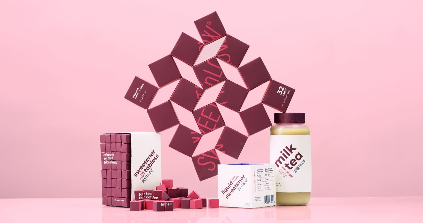
Sweet'N Low Rebrand
packaging, brandingAn American classic, Sweet'N Low's refresh moves beyond its 50s American diner aesthetic and towards the celebration of diverse communities through food and play.
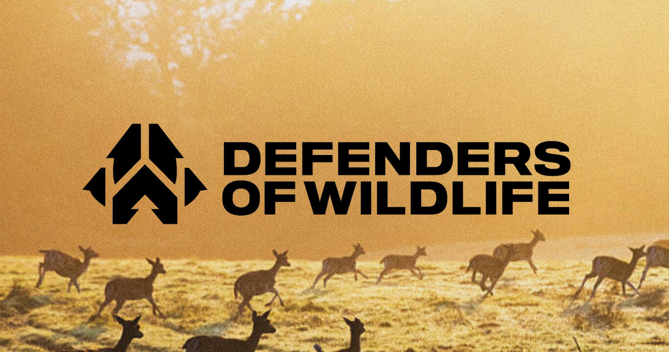
Defenders of Wildlife Rebrand
brandingWith a dedicated history to protecting North American wildlife, Defenders of Wildlife's rebrand evolves the organization to become an international force towards environmentalism and wildlife preservation.
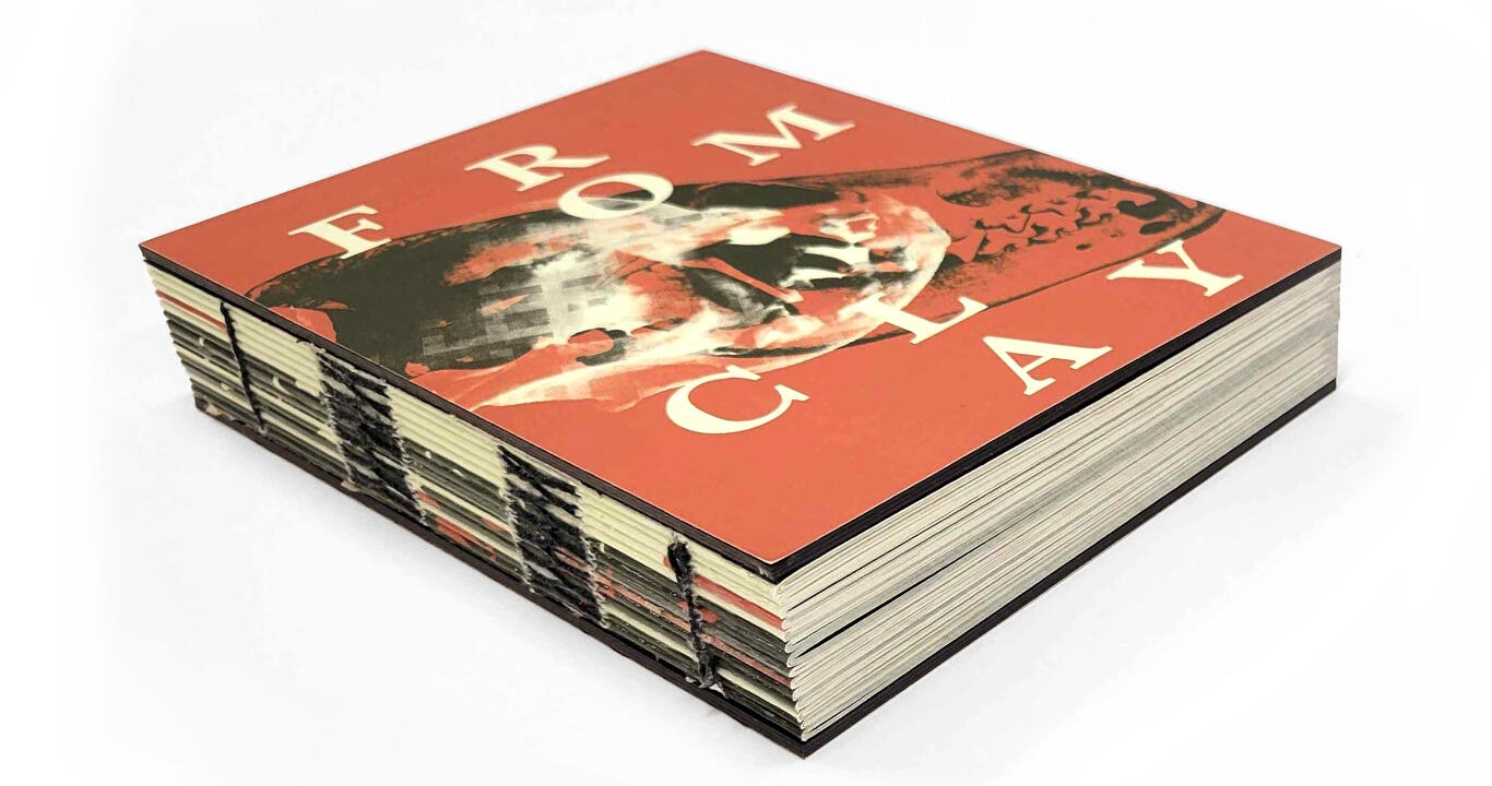
From Clay
book designFrom pets to produce to eugenics, From Clay critically analyzes how society has shaped plants, animals, and people for our benefit or aesthetics, even if it's to the detriment of biodiversity and bioethics.
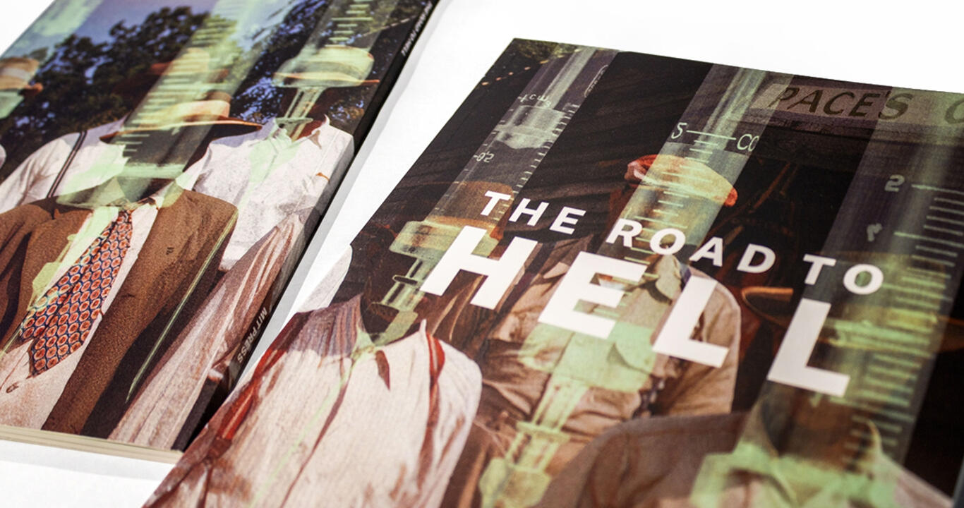
The Road to Hell
book designInformed consent is a crucial aspect of academic study, especially in medicine. The Road to Hell critically analyzes the Tuskegee Syphilis Study and its relationship to race, medicine, and the sociopolitical sphere of the United States in the contemporary age.
Meat Cute
compositorMeat Cute is a queer romantic comedy following a butcher who is head-over-heels in love with the tailor across the street. Though his knives are sharp, his romance skills are unfortunately not quite up to par. Directed by Wen Tong-Everitt, Meat Cute has appeared in multiple film festivals worldwide.
Cheep: Bird Garden Kit
packaging, brandingWith the rise of urban communities, native flora and fauna are quickly losing their habitats. Cheep's bird garden kit aims to educate and encourage the growth of biodiversity in a backyard garden through an introductory kit.
Drawn to the Beat
motion design, installationAs one of the most well-known markers in the world, Drawn to the Beat combines music and visuals to push Posca beyond its status as just a paint marker and towards its core: creativity and self-expression.
HEY!

illustrator, graphic designerI'm Tan (or Tare). I love exploring what makes art and design fun, whether it be through bold, expressive visuals or a strong conceptual force driving it.I'm a huge fan of avian wildlife and rich, dramatic storytelling. My free time is mostly spent on imagining new stories for characters I've written, and I regularly try to incorporate them into my projects, even if it's just their names.When I'm not doing anything related to the arts, you can probably find me playing MapleStory.


Proficiencies
inDesign
Photoshop
After Effects
Illustrator
Procreate
Clip Studio PaintFamiliar
Figma
Copywriting
HTML
CSSEducation
Rhodes College
Fall 2021 – Spring 2022ArtCenter College of Design
Fall 2022 – presentExperience
ArtCenter College of Design | Pasadena, CA
Peer advisor Oct 2024 – presentTeaching assistant May 2024 – presentTeaching assistant
September 2024 – presentMeat Cute | Remote
Compositor
February 2024 – April 2024No Twigs Attached | Remote
Concept artistLakeland Preparatory School | Remote
Graphic designer


FOR PROFIT.
FOR SHOW.
FOR UTILITY.
FOR MANKIND.
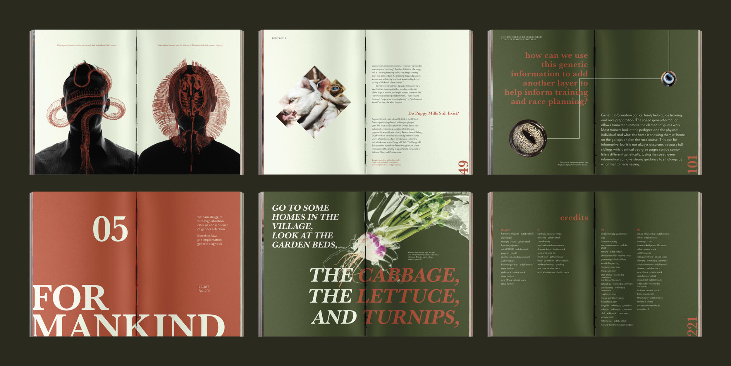
From wolves to pugs and dobermans, selective breeding is a practice as old as time. The book's title and concept derives from the creationist myths of life borne from clay, alluding to the notion of playing god. From Clay critically analyzes selective breeding in the modern era, exploring humanity's motivations and the moral and ethical implications that arise from the practice.I wanted my design to reflect the scientific nature of the topic. From the French link binding and typeface itself, each element of the design incorporates genetics and the concept of selective breeding.


with special thanks toTracey Shiffman
Han Wang


SWIFT.
WELCOMING.
JUBILANT.
EXPRESSIVE.
MODULAR.
HARMONIOUS.
Sweet’N Low welcomes jubilant self-expression within communities. Whether you’re more spontaneous or more methodical, we celebrate, don’t discriminate— it’s your choice.Sweet'N Low is an artificial sweetener brand from the United States. First introduced in diners in 1957, the pink packets swiftly became a recognizable staple. As a callback to their roots, their brand is still strongly based on the retro American diner aesthetic. With this refresh, Sweet'N Low transforms into a contemporary brand that celebrates diversity and community through food.I wanted to emphasize that the stigma around artificial sugars shouldn't discourage people from taking it. People have their own needs and preferences, and the brand celebrates these differences with open arms.The emphasis on celebrating diversity is also shown in the forms. Starting with the simple cube, I wanted to express both jubliance and modularity through how one would interact with the product. With a flexible dieline for the wafers and tablets, I wanted to emphasize playfulness in both the brand and forms.


with special thanks toAnia Borysiewicz
Zack Gibson
Ashley Chavez
Saul Barrera
Sofia Avilez
Andreia Avilez


PROUD.
PROTECTIVE.
STRONG.
CONFIDENT.
UNIFIED.
Defenders of Wildlife is the premier US-based global conservation organization dedicated to the protection and restoration of imperiled species and their habitats. Our team has the experience and knowledge to engage in any arena to protect wildlife, such as Congress, the courts, federal and state agencies, academia and public debate, and does so tirelessly and effectively.Defenders of Wildlife (Defenders) is a nonprofit organization focused on the conservation of North American species, spanning from the coasts of Mexico to the mountains of Canada. With this refresh, I wanted to expand their scope to a global scale as well as reposition Defenders as a modern brand with a bold, assertive voice that leads the conservation efforts worldwide.The most significant change was the logomark. Defenders of Wildlife previously specialized in wolves. However, in combination with the outdated graphics, the wolf being the sole animal represented limits the scope of the organization. For the new logomark, GAIA, I combined the symbols of the wolf’s paw, our home, and the forest, creating a badge of pride and protection.


with special thanks toGerardo Herrera
Elliana Lee
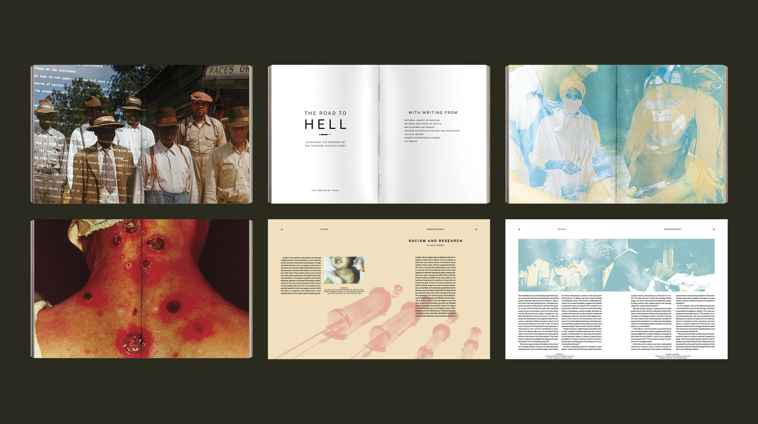


THE ROAD TO HELL IS PAVED WITH GOOD INTENTIONS.
The Tuskegee Syphilis Study (1932–72) was conducted by the U.S. Public Health Service as a means to research the effects of syphilis on the human body. Under the guise of free treatment, they gathered 600 black men from Tuskegee, Alabama. Over a span of 40 years, a treatment for syphilis was discovered and intentionally kept from the men, resulting in the deaths of 128 men due to the government's negligence and pursuit of knowledge.The primary objective of this layout was to make people feel uncomfortable, as the history of the study should elicit this response. The subject was to be handled sensitively and not overly designed with greater emphasis on the history and its records, similar to how academic texts are read. While working on this layout, I realized that the effects of the study can be traced now to post-COVID. In a time where vaccinations are considered necessity to control the virus, there is still hesitancy and distrust towards the government. I wanted to explore this and connect contemporary issues with the past.


with special thanks toTracey Shiffman
Cheryl Miller
Addis Barge
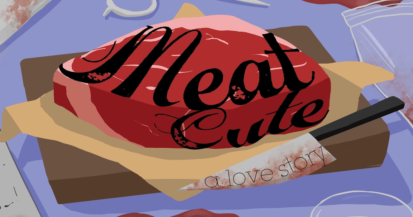
LOVE IS RARE
Head over heels in love, a naive butcher must prove that he exists to the boy from the tailor shop, but how? An inconvenient rip of his apron provides the apprentice with the perfect opportunity...Directed by Wen Tong-Everitt, Meat Cute is a 2D-animated queer comedy that revolves on the trials and tribulations of a hapless butcher that found himself hopelessly in love.It was an honor to work with the Meat Cute team and see the developments push forward weekly. Compositing was done in collaboration with other peers, which helped me significantly through the process. Working on Meat Cute revealed another side of animation that I've never seen before, both in compositing and concept work.
with special thanks toWen Tong-Everitt
D Seo
The Meat Cute Team
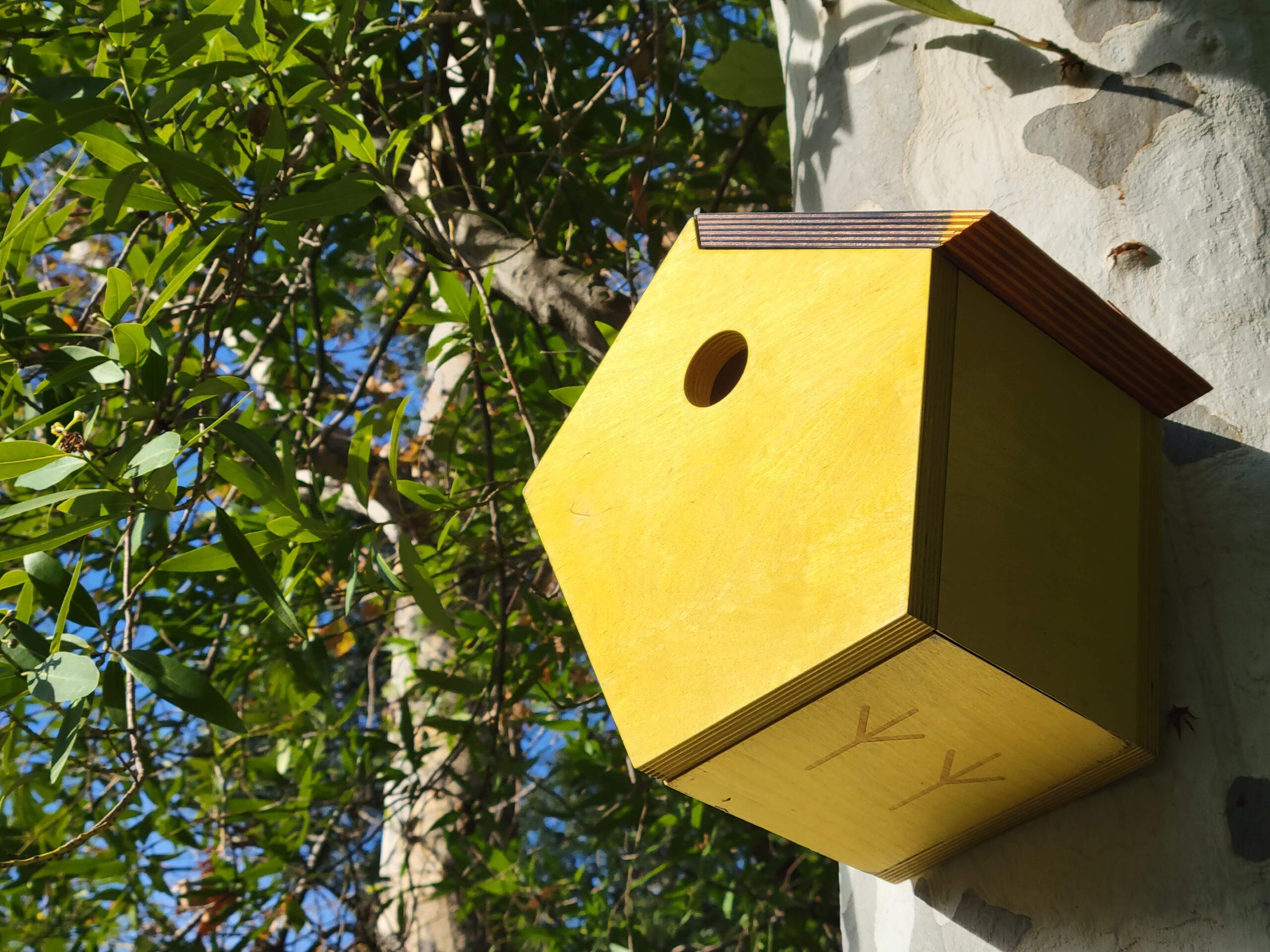


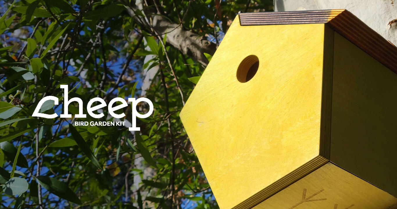
GROW YOUR OWN BIRDSEED
Why buy birdseed when you can grow your own? Learn more about native flora and avian fauna as you grow a garden that both you and your feathered friends can enjoy!I love biodiversity. From the plants to the animals, the interconnectedness is what makes Earth beautiful. While gardens are often made for the human aesthetic, I wanted my kit to emphasize the importance of native flora and how intertwined they are with fauna. Maintaining a garden of indigenous flowers is less daunting, as they are much more suited for the environment one would plant them as opposed to a naturalized plant.While designing my package, I wanted to create a visually appealing and multipurpose package that stands out amongst the competition. Most kits are simple box shapes, and I wanted to incorporate the aesthetics of both birds and gardens into my work.As an extension, I also created a site that Cheep would host their products on.
with special thanks toDaniel Hoy
Lynnea Jeung
Tyler Paulson


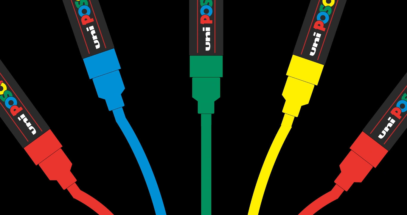
DRAWN TO THE BEAT
POSCA is a brand owned by Uni, known primarily for their paint markers that come in a variety of colors. With a focus on creativity that extends beyond paper, I wanted to create an ad that effectively demonstrates the brand and what it is selling. I also wanted it to focus more on the capabilities of POSCA rather than just showing what POSCA pens are.I further extended this concept into an interactive installation. People would be able to approach human-sized POSCA pens and draw anything they'd desire on the ground, with each new line introduced adding to a harmony that would play overhead.
with special thanks toAaron Björk
Miles Mazzie
Charlie Sin


SORRY!
This page is still a work in progress.